

The Macro Regime Quad: A Simple Map for a Complicated Market
Before you figure out where the market is going, figure out where you are.

This is the first post in a series that walks you through the Defy the Odds Investment Framework, piece by piece. The system has multiple layers, from macro regime classification to intermarket diagnostics to stock selection. We start here, with the foundation: the Macro Regime Quad. If you understand this, everything else that follows will make more sense.
You’ve been there. Inflation comes in hot, you brace for a selloff, and the market rips higher. Or the data is exactly what everyone wanted, a soft landing confirmed, and somehow the market drops. You check the headlines, read the takes, and none of them explain why the same number just did the opposite of what it did last time.
That’s not randomness. That’s context. And to read it consistently, you need a framework that organizes the noise into something actionable. That’s what the Macro Regime Quad is.
Its biggest advantage is that it focuses on something most people skip.
Instead of trying to predict what happens next, the system tells you precisely where you are and which direction you’re moving.
That matters more than it sounds, because where you are right now often determines where you can go next. And that knowledge, paired with patience, is what generates alpha.
Two Forces, Four Worlds
The Quad is a simple map built on two axes.
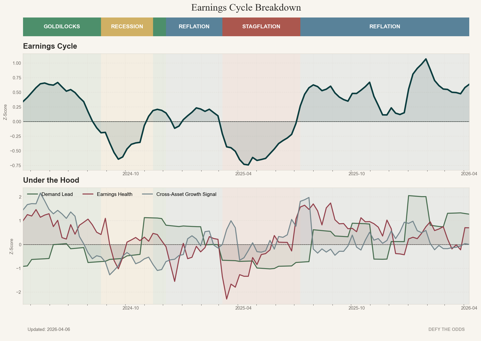
The vertical axis is Growth. Markets are forward-looking. They don’t wait for GDP to confirm what’s already happened. So the Growth score is built from the most forward-looking indicator families available: leading economic activity (new orders vs. inventories, not trailing output), corporate health (earnings revisions, not last quarter’s results), and market-based confirmation (is the market’s own behavior consistent with the macro data, or diverging from it?). When all three layers point the same way, the signal is strong. When they conflict, you treat it with caution.
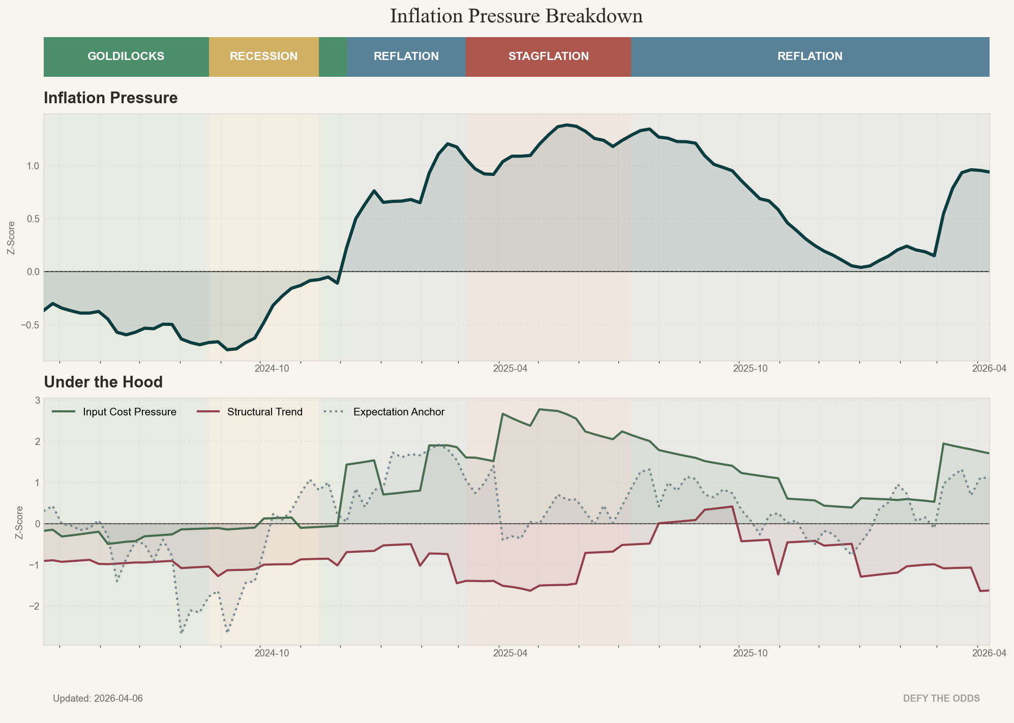
The horizontal axis is Inflation. Also not a single CPI print. Three layers: the current level (how high is inflation right now?), the impulse (is it accelerating or cooling?), and expectations (what is the market pricing in for the future?). The level alone doesn’t tell you much. Inflation at 4% that’s falling fast is a completely different animal than inflation at 4% that’s reaccelerating.
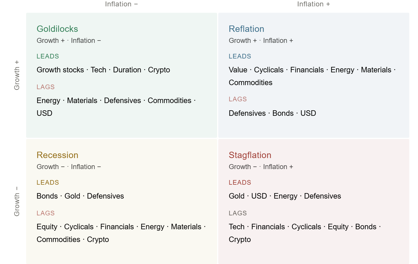
These two forces together create four distinct environments. Four regimes. Each one has its own logic, its own winners and losers, its own rules for how capital flows.
One more thing that matters. The system doesn’t care about absolute levels. It measures where each variable stands relative to its own two-year average, a rolling z-score. In plain terms: is growth running hot or cold compared to where it’s been recently? Is inflation heating up or cooling down versus its own recent norm?
This has a counterintuitive consequence. You can have objectively decent GDP growth and moderate inflation, and the system can still place you in the Stagflation quadrant. How? If growth has been strong but is now weakening relative to its two-year trend, and inflation has been low but is now firming relative to its own baseline, the direction of both is moving into the worst combination. The headlines still look fine. The regime has already shifted. That’s exactly the kind of moment where most investors get blindsided, and exactly where this system earns its value.
The Four Regimes
Goldilocks — Growth Up, Inflation Down
This is usually the market’s favorite environment. The economy is improving, inflation is fading, and central banks have room to stay accommodative or even ease. Capital flows toward growth, duration, and risk. This is where quality growth stocks tend to lead, where bonds can rally alongside equities, and where the classic “everything works” narrative takes hold.
But don’t confuse it with safety. Goldilocks is comfortable until it isn’t. It often ends when inflation stops cooperating, or when growth gets so hot that it pulls inflation back up. At that point, you’ve moved into a different quadrant, and what worked stops working.
Reflation — Growth Up, Inflation Up
Growth is strong, but inflation is rising with it. This is a hotter, messier environment. Central banks start getting nervous. Duration gets punished. The leadership rotates: cyclicals, value, energy, materials, financials. The economy is strong enough to absorb higher prices, but the market starts discriminating. What worked in Goldilocks (long duration growth, bonds as a hedge) starts to fail.
Reflation is where many investors get caught flat-footed, because the economy feels fine but the portfolio is quietly bleeding. The macro is good, but the wrong kind of good for the positioning they built in the previous regime.
Stagflation — Growth Down, Inflation Up
This is the quadrant nobody wants to be in. Growth is weakening, but inflation refuses to come down. Central banks are stuck: they can’t ease without fueling inflation, and they can’t tighten without killing what’s left of growth. The playbook that worked in every other regime falls apart here, because bonds and equities can sell off together. Gold tends to outperform. Cash becomes attractive. Defensives hold up better, but nothing truly thrives.
Stagflation is where you find out whether your portfolio was diversified or just long everything in disguise. Most of the time, it’s the latter.
Recession — Growth Down, Inflation Down
The problem here isn’t prices. It’s demand. Earnings come under pressure, credit tightens, risk appetite collapses. The market becomes defensive: utilities, healthcare, staples. Bonds tend to rally because the market starts pricing rate cuts and slower growth ahead. But don’t mistake that rally for a green light. It’s not the market saying things are getting better. It’s the market pricing in how bad they’re getting.
Recession is where the optimists get punished. Every bounce feels like the bottom, and the investors who buy each one find out they were early, again and again.
The Worm
The chart above shows you the four quadrants. But the system doesn’t just tell you which box you’re in. It tracks the path.
On the chart below, you’ll see a trailing line that maps the system’s movement over the past year. I call it the Worm. The dot is where you are now. The trail shows where you came from and which direction you’re heading.
This matters for two reasons:
First, you can see regime transitions as they develop, not after the fact. If the Worm is drifting from Goldilocks toward Reflation, you know the environment is shifting before the headlines catch up.
Second, you can cross-check the Worm’s direction against what’s actually happening in the market. If the system says you’re moving toward Stagflation but risk assets keep rallying, that’s a divergence worth paying attention to. Either the system is early, or the market is late. Both are valuable information.
What This Means for Your Portfolio
Take rising oil prices. In Reflation, that’s natural. The economy is strong, demand is growing, and commodities are part of the leadership. You lean into it. In Stagflation, rising oil is a completely different story. It’s a cost shock squeezing margins, hurting consumers, and making the central bank’s job harder. Same move in the commodity market. Opposite implications for your portfolio. The difference is the regime.
This is why most portfolios break when the environment shifts. They’re built for one regime, usually Goldilocks. Long equities, overweight tech, maybe some bonds for diversification. That works beautifully until the regime changes, and then the same portfolio that was compounding quietly starts bleeding.
The Quad gives you a systematic way to rotate. Each regime has its own set of assets and sectors that tend to lead, and its own set that tends to lag. When the system identifies a regime shift, that’s your signal to re-examine what you own and whether it still fits the environment.
Where the Quad Fits
The Macro Regime Quad is the first sorting mechanism. It tells you what game the market is playing right now, and it prevents you from running the wrong playbook. But it’s not the whole system. It’s one of three Quads, each answering a different question.
The Macro Regime Quad answers what to own. Which sectors, which asset classes benefit from the current regime? The background environment determines the menu.
The Trader’s Quad (Liquidity vs. Risk Appetite) answers when to act. Is there enough liquidity to support risk-taking, or is the market running on fumes? This is the tactical timing layer: when to press the accelerator, when to step back.
The Allocator’s Quad (Liquidity vs. Duration) answers how to allocate. How does the bond-equity-commodity triangle behave in this liquidity environment? Are bonds a hedge or a risk? Is duration your friend or your enemy?
The three together give you the full picture. The Macro Quad sets the regime. The Trader’s Quad tells you whether the regime has fuel behind it. The Allocator’s Quad tells you how the major asset classes interact within it. The next posts in this series will walk through each one.
Where to Go from Here
Now you understand the map. You know the four regimes, you know what drives them, and you know which assets and sectors tend to lead in each one. That’s the foundation.
But knowing the regime is only half the job. The other half is using it.
When do you trust a pullback and when do you cut?
When a sector breaks out that doesn’t fit the current regime, how do you tell whether it’s a real rotation or a trap?
When the market is chaotic and nothing seems to make sense, how do you simplify the decision?
And how does the Worm’s position on the chart change the type of trading that works?
That’s what the rest of this post is about. And every Monday, these same principles drive the Macro Playbook, where I show you which quadrant we’re in, what’s changing, and what it means for trading tactics.
